
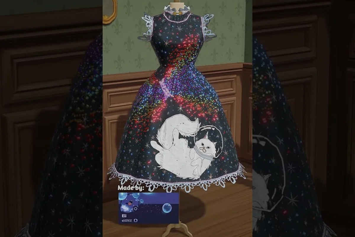
Good decoration placement in Dressmaker starts long before you pick up a needle. The sketchbook is your freeform canvas, and every appliqué, bow, and lace trim you drop there will eventually translate into a stitched, sewable pattern on the mannequin. Getting that translation right is what separates a charming commission from one that looks chaotic in 3D. This guide walks through the full placement workflow on the sketchbook, how color palettes interact with the rest of the dress, and how to shape designs that read clearly as either cute everyday pieces or formal evening gowns.
How the Sketchbook Placement System Works
The sketchbook is where dressmaker decoration placement actually begins, and it follows a layered, z-stacked logic rather than a grid. Each item you place — an appliqué, a button cluster, a bow, a lace trim — sits on its own layer, and layers stack visually in the order you create them. Later items paint on top of earlier ones, which means your last clicks will always sit on top. That single rule drives almost every placement decision in the game.
According to the official Dressmaker store page on Steam, the full making loop begins in the sketchbook with fabric samples and appliqués, then moves to paper pattern arrangement before the design is previewed on the mannequin. That sequence matters: anything you mess up on the sketchbook ripples into the pattern stage and then into the final 3D preview. The mannequin preview is honest — items that overlap on the sketchbook will overlap on the dress, and items that float off the silhouette will get cropped by the pattern boundaries.
The freeform decorating tool supports rotation, scaling, and per-layer opacity. You can spin an appliqué to any angle, stretch it to fit a bodice curve, or drop its opacity so a fabric pattern shows through underneath. This is what makes dressmaker freeform decorating feel closer to digital scrapbooking than to rigid pattern drafting. You are not snapping pieces to preset slots; you are painting shape and color onto a flat representation of the dress.
Stacking Trims Nearest to the Fabric
The first piece you place becomes the visual foundation. If you start with a full-skirt lace trim and then drop a small heart appliqué on top, the heart will sit cleanly above the lace. If you reverse that order, the heart will get hidden behind the lace wherever they overlap. Players who run into "my appliqué disappeared" issues almost always placed a large trim after a small detail.
| Layer Position | Visual Effect | Best Use Case |
|---|---|---|
| Bottom (placed first) | Sits behind everything | Base lace, hem trim, fabric-printed motifs |
| Middle | Partially covered by top layers | Appliqués, ribbon bands, mid-scale details |
| Top (placed last) | Fully visible | Focal embellishments, small buttons, finishing bows |
A second quirk of the layer system: items on the same layer cannot be reordered by clicking — you have to delete and re-place them. This makes planning your placement order as important as the placement itself. Most experienced players lay down background trim first, then medium-scale motifs, then finish with one or two focal pieces on top.
Planning Color Palettes Before You Place Anything
Dressmaker sketchbook coloring works in two stages: first you assign a fabric color (which becomes the base color of the dress panel), then you place decorations whose colors stack on top. The interaction between fabric color and decoration color is what creates the final palette feel. A coral appliqué on a white cotton dress reads playful; the same coral on a deep navy reads dramatic and intentional.
Color palettes work best when they follow a simple three-role structure. Pick a dominant color (the fabric), a secondary color (one or two large decoration pieces), and an accent color (small buttons, bows, or trims that pop). Trying to fit four or five equally weighted colors into one dress almost always produces a muddy result, especially in the final 3D preview where reflections and shadows mute subtle contrasts.
| Palette Role | Recommended Coverage | Example Pieces |
|---|---|---|
| Dominant (fabric) | 60–75% of visible area | Cotton or linen base, large skirt panels |
| Secondary (mid-layer) | 15–25% | Lace trim, ribbon sash, mid-size appliqués |
| Accent (top layer) | 5–10% | Buttons, small bows, embroidery dots |
Dressmaker color palettes also interact with fabric type. Velvet and silk reflect light differently than cotton and linen, which means a pale pink appliqué on silk looks more luminous than the same pink on linen. For formal dress designs, this matters — silk and velvet tend to reward rich, saturated palettes, while cotton and linen suit muted, pastel-leaning palettes for cute dress designs.
Matching Palette to Occasion
The game's commission system grades your work against the customer's social calendar, and the occasion strongly hints at what palette will land. Garden parties, picnics, and casual dates skew toward bright, high-contrast cute dress designs. Weddings, galas, and royal events skew toward tonal, low-contrast formal dress designs where one or two colors carry the whole composition.
Players report on community threads that a tonal palette (for example, dusty rose fabric, mauve lace, and wine-red buttons) scores higher on formal commissions than a rainbow palette, even when both use the same number of decoration pieces. The reason is that tonal designs look more expensive and read as intentional craftsmanship, while rainbow designs read as playful but visually noisy under the formal event's lighting.
Shaping Cute Dress Designs Through Placement
Cute dress designs lean on three placement habits: rounded motifs, symmetric layout, and bright-but-balanced palettes. Rounded motifs — hearts, flowers, bows, polka dots — sit naturally at the bodice center, the skirt hem, or as repeating bands across the waistline. Avoid sharp or angular appliqués for cute commissions; they read as aggressive rather than charming on the mannequin preview.
Symmetry is the second pillar. Cute designs almost always use mirrored or near-mirrored placement: one bow on each shoulder, a heart appliqué centered on the chest, a row of buttons running straight down the front. The sketchbook makes symmetry easy because you can place one item, then duplicate it and flip the duplicate horizontally. Asymmetric placement in cute designs is risky unless it is very deliberate, and the game's commission grading usually penalizes it.
| Cute Design Element | Recommended Placement | Why It Works |
|---|---|---|
| Heart appliqué | Bodice center, 1–2 inches below neckline | Draws eye to face, reads as sweet |
| Bow cluster | Shoulders, waist sash, or back of skirt | Adds volume without bulk |
| Polka-dot trim | Hem, sleeve cuffs, neckline | Repeats rhythm without visual noise |
| Small buttons | Placket, pocket corners, bodice straps | Adds fine detail at close range |
Cute designs also benefit from one or two small appliqués scattered on the skirt, which is where the freeform tool shines. You can drop a few small flowers at different angles to suggest a hand-picked feel, but keep their count under five to avoid cluttering the silhouette. Each extra small piece costs visual budget without adding new information, and the mannequin preview will show that clutter immediately.
Cute Palette Suggestions
For cute dress designs, start with pastel cotton or linen in pink, mint, sky blue, or butter yellow. Layer a white lace trim along the hem and neckline as the secondary, and pick a single saturated accent — cherry red, lavender, or coral — for bows and buttons. This three-color structure keeps the design legible at any zoom level in the preview and matches what the customer usually expects from a casual commission.
Building Formal Dress Designs Through Placement
Formal dress designs work on the opposite principles from cute ones. Instead of bright contrast and rounded motifs, formal commissions reward restrained palettes, vertical emphasis, and one strong focal point. The most common formal-dress mistake is over-decorating — placing too many pieces, which makes the design read as busy rather than elegant. The decoration budget should go into a few well-placed items, not many small ones.
Vertical emphasis comes from how you align decorations. A column of small buttons running from neckline to waist, a vertical lace panel down the center of the bodice, or a single long sash draping from shoulder to hem all create the tall, elongated silhouette formal occasions demand. Horizontal trim at the waist is fine in moderation, but multiple horizontal bands stack visually and shorten the dress on the mannequin.
| Formal Design Element | Recommended Placement | Why It Works |
|---|---|---|
| Vertical lace panel | Center front of bodice, top to waist | Elongates silhouette |
| Single statement bow | Back of waist or off-shoulder | Creates focal point without clutter |
| Beaded trim | Neckline only, not hem | Frames face, signals craftsmanship |
| Tonal appliqué | Hip or hip-to-hem, asymmetric | Adds interest without breaking elegance |
The decoration count achievement and related design milestones reward variety, but the formal commission grading rewards restraint. A silk gown with one vertical lace panel and a single waist bow will often outscore a heavily decorated cotton dress, because the silk's fabric quality and the clean layout signal craftsmanship. Players chasing shop achievements should plan separate dresses for each grading system rather than trying to satisfy both at once.
Formal Palette Suggestions
For formal dress designs, start with deep-toned silk or velvet in navy, emerald, burgundy, or charcoal. Add a tonal secondary in a slightly lighter or darker shade of the same hue — dusty blue on royal blue, plum on burgundy, gold-threaded trim on charcoal. Skip bright accent colors entirely, or limit them to a single metallic touch (small gold buttons or a thin gold sash). The palette should feel like a single color family, not a curated mix.
Step-by-Step Decoration Placement Workflow
A repeatable workflow removes most of the trial-and-error from the sketchbook stage. The following sequence is what experienced players use to produce clean, high-scoring designs without over-decorating or running out of decoration budget mid-piece.
| Step | Action | Why It Matters |
|---|---|---|
| 1 | Choose fabric and base color | Sets dominant palette tone |
| 2 | Place largest trim first (lace, ribbon band) | Establishes silhouette boundary |
| 3 | Add medium appliqués (bows, motifs) | Builds secondary visual layer |
| 4 | Add small accents (buttons, dots) | Finishes close-range detail |
| 5 | Preview on mannequin | Catches overlap and off-silhouette placement |
| 6 | Adjust opacity, rotation, scale | Refines without re-placing items |
| 7 | Move to paper pattern stage | Translates sketchbook layout to sewable panels |
The mannequin preview at step 5 is the most important checkpoint. It will show you exactly which appliqué pieces clipped off the silhouette because they floated beyond the pattern boundary, and which items overlap in a way the 2D sketchbook hid. If a button cluster is sitting halfway off the bodice in 3D, you need to move it back toward center on the sketchbook before continuing to the pattern stage. The preview is the only honest test of freeform placement, and skipping it is the single most common reason a finished dress looks messy on the mannequin.
Budget management also belongs in this workflow. Each decoration piece has a cost, and over-spending on one dress leaves fewer resources for the next commission. Players report that aiming for 6–10 decoration pieces per formal dress and 10–15 per cute dress hits a sweet spot for both grading and budget. Crossing 20 pieces on a single dress almost always produces over-decoration, which both the commission scoring and the shop window display will penalize. The Dressmaker fabric and decoration layering breakdown goes deeper into how decoration budget and layering interact when you push the count higher.
Frequently Asked Questions
How many decoration pieces should I use on one dress?
For most commissions, 6–10 pieces work best on a formal dress and 10–15 on a cute dress. Going past 20 pieces usually triggers over-decoration penalties in the commission grading and the shop window display, and the mannequin preview will start to look visually crowded even if each piece is well placed.
Can I edit a decoration after placing it on the sketchbook?
Yes, you can rotate, scale, and adjust opacity on any placed piece without deleting it. You can also move pieces within the same sketchbook canvas, but you cannot reorder layers without deleting and re-placing the affected items. Plan your placement order before you start clicking.
What is the best fabric for formal commissions?
Silk and velvet are the strongest choices for formal commissions because their light reflection reads as expensive in the mannequin preview. Pair silk with a tonal palette and minimal decoration, and reserve cotton and linen for cute everyday commissions where the customer expects a playful look.
How do I avoid my appliqué disappearing behind other layers?
Place larger background trims first, then medium motifs, then small finishing accents on top. The sketchbook layers stack in the order you create them, so items placed later always sit on top. If a small piece vanishes after you add a large trim, delete the trim, re-place the small piece, and then re-add the trim beneath it.
Does the mannequin preview match the final sewn dress exactly?
The preview is highly accurate but not pixel-perfect. Fabric color may shift slightly under different lighting in the shop window versus the preview, and fabric grain alignment (grain-aligned versus bias cuts) can change how trim sits on the final garment. Still, the preview is the most reliable test of placement before you commit fabric to the sewing machine.