Dressmaker picky customers can turn a relaxed afternoon of sewing into a tense guessing game where every fabric choice and color swatch seems to miss the mark. The good news: the request system in Dressmaker gives you concrete clues about what townsfolk actually want, and reading those clues well is the difference between a glowing five-star review and a politely disappointed sigh. This guide breaks down how to read dressmaker picky customers' briefs, match the right fabric and color to each event, and keep themed commissions on track.
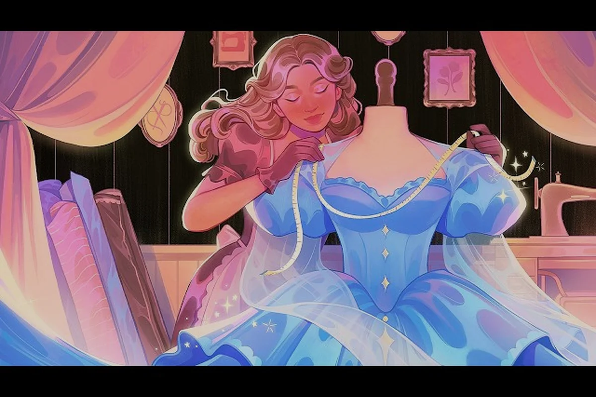
According to the official Dressmaker page on Steam, customers arrive with a specific occasion in mind, and the in-game sketchbook lets you preview your design on a mannequin before you ever thread the sewing machine. That preview window is the single most important tool you have for satisfying dressmaker picky customers, and we will come back to it again and again.
Reading the Request Brief Like a Detective
Every picky customer in Dressmaker walks into your shop with a short brief taped to their order card. That brief never spells out the exact answer, but it always contains three readable signals: the event type, a hinted style direction, and a soft preference for color or fabric. Once you train yourself to pull those signals apart, dressmaker picky customers stop feeling random and start feeling like solvable puzzles.
The Three Signals Hidden in Every Commission
Treat each request as a stack of three layers — a base layer for the event type, a mid layer for the style hint, and a top layer for the color or fabric preference — and work through them in that exact order before you ever pick up a pencil. That sequencing matters because a formal wedding brief will completely override a customer's stated preference for "something soft," while a casual harvest-fair request leaves far more room for the adjective cluster to steer silhouette and decoration. Front-loading the event register also prevents the most common complaint logged in picky-customer reviews: the dressmaker skipping the theme and treating "stand out" as a license for a loud color choice that clashes with the occasion.
| Signal | Where It Appears | What It Tells You | Common Trap |
|---|---|---|---|
| Event type | Opening line of the brief ("for the harvest fair", "to my cousin's wedding") | Casual, formal, or themed register | Confusing a garden party with a wedding |
| Style hint | Adjective cluster ("something soft", "I want to stand out", "nothing flashy") | Silhouette and decoration density | Reading "simple" as "plain" when the customer actually means "uncluttered but elegant" |
| Color or fabric hint | A named color, mood word, or texture word near the end | Specific palette or material direction | Assuming the named color is the only acceptable choice — it is usually a preference, not a demand |
Players who map these three signals onto a fabric and color decision before they touch the sketchbook report noticeably higher satisfaction scores. If you need a refresher on how requests translate into reward outcomes, the commissions guide walks through the full reward structure.
Decoding Phrases the Brief Actually Uses
The brief copy in Dressmaker is short on purpose — each adjective is essentially a single-slot hint that maps to a fabric category, color preference, or occasion register without spelling out the underlying variables. Experienced players have stress-tested the request wording against hundreds of picky customer commissions, and the translator table below condenses the consensus read for each phrase, including how it shifts when the same adjective shows up in casual request guide, themed commission, or formal event dress contexts.
| Brief Phrase | Likely Fabric Match | Style Read |
|---|---|---|
| "Light and breathable" | Cotton or linen | Casual, often daytime or warm-weather |
| "Warm but not heavy" | Wool or a layered cotton | Transitional season, outdoor events |
| "Sheen, drape, or fluid" | Silk | Formal, romantic, evening-coded |
| "Rich, plush, regal" | Velvet | Formal, winter, themed commissions |
| "Simple and unfussy" | Cotton or linen, minimal trim | Casual request guide territory |
| "I want to stand out" | Velvet or silk with strong color | Formal event, attention-seeking |
| "Matches the season" | Wool for cold, linen for warm | Themed commission tied to calendar |
Notice how the same adjective — "light", for example — points to a casual or warm-weather register almost every time it appears in a picky customer request, and that consistency is what makes the system learnable rather than random; cross-check the translator table and you'll see "light and breathable" maps to cotton or linen, the same pairing "simple and unfussy" falls back on, while a "light" hint nested inside a formal event dress or themed commission brief usually upgrades the fabric to silk with reduced trim rather than swapping the fiber entirely. The slot behaves like a stable input variable, which is why Dressmaker's commission scoring rewards players who lock in one fabric category per adjective cluster instead of mixing casual and formal event cues inside the same commission.
Casual Request Guide: Decoding Low-Stakes Commissions
A casual request guide mindset is essential because casual commissions are the most frequent type you will see, and they are also where dressmaker picky customers get the most nitpicky. The stakes feel small, but a botched casual dress still costs fabric, time, and a reputation tick. The trick is to treat casual briefs as a precision exercise, not a throwaway.
The Casual Customer Personality
Casual briefs in Dressmaker tend to come from townsfolk who want comfort and a clean silhouette. They rarely ask for ornament, but they do notice when a hem sags, when a color clashes with their skin tone, or when the fabric choice looks too stiff for the season. Community discussions on the Steam community board confirm that casual customers are the group most sensitive to fabric feel rather than decoration.
Three rules of thumb cover most casual briefs because the customer's satisfaction score is driven by a small set of high-weight attributes rather than dozens of micro-details: fabric drape against the body, color harmony with skin tone, and absence of fussy ornamentation. Treat those three axes as the scoring backbone, then let trim, neckline, and silhouette shape be the secondary tie-breakers that move a satisfied customer into a delighted one.
-
Default to cotton or linen. Both fabrics read as relaxed, breathable, and unfussy — exactly the register casual customers expect. The fabric restock patterns in the fabric inventory guide explain how to keep a steady supply of both.
-
Pick mid-saturation colors. Pale blues, soft greens, warm taupes, and dusty pinks tend to land well. Neon brights read as a mismatch.
-
Use minimal trim. One or two decorative elements at most, such as a small bow or a single line of lace. Over-decorating a casual brief is the fastest way to lose points.
Casual Request Style Match Table
| Casual Event | Best Fabric | Color Family | Trim Budget | Common Mistake |
|---|---|---|---|---|
| Market day or errand run | Cotton | Earth tones, pastels | 0–1 trim pieces | Adding a loud pattern that clashes with everyday errands |
| Picnic or garden meet | Linen | Soft greens, cream, sky blue | 1 trim piece (lace or bow) | Choosing a heavy fabric that looks out of place outdoors |
| Quiet visit to a neighbor | Cotton | Muted neutrals | 0–1 trim pieces | Over-engineering a simple brief with too many layers |
| Work or shop duty | Cotton or light wool | Dusky colors, navy, warm brown | 0 trim pieces | Selecting a sheen fabric that reads as evening wear |
| School or study day | Cotton | Pale blues, soft greys | 0–1 trim pieces | Picking a luxury fabric the customer will feel overdressed in |
The casual request guide is essentially a discipline of restraint, and the table above shows why: every row pairs a low-stakes occasion with cotton, muted earth tones, and 0–1 trim pieces, with a documented "Common Mistake" column flagging the over-reach. For picky customers who arrive describing a market run but secretly want a formal-event silhouette, that misalignment is where dressmaker fabric preferences collide with dressmaker color preferences — a velvet bolt at midday reads as costume, not craft. A simple cross-check before cutting: does the requested fabric appear in any row of the table for that event? If not, talk the brief back to cotton and a muted color family before any trim budget is unlocked.
Formal Event Dresses: Decoding High-Expectation Commissions
Formal event dresses flip the entire logic. Now the customer expects sheen, structure, and a clear sense of occasion. This is also where dressmaker picky customers become the most demanding, because they are investing real social capital in your work and they will judge it harshly.
The Free Lives press kit frames the design range of Dressmaker as running "from simple summer dresses up to extravagant royal gowns", which is a useful anchor: formal commissions sit on a spectrum from elegant-but-grounded to flamboyant, and your job is to place the customer's brief on that spectrum correctly.
Reading the Formality Gradient
Clients often arrive insisting they need a "formal" gown, but when the dressmaker presses for the actual venue, the brief unravels. A charity luncheon, a courthouse wedding, and a black-tie embassy reception each sit at very different points on the formality gradient, and the table below breaks those tiers down by event type, fabric, and color direction. Reading the brief literally, rather than matching the stated adjective to the real occasion, is one of the most common complaints picky customers raise after delivery.
| Formality Tier | Typical Events | Preferred Fabric | Color Direction | Decoration Level |
|---|---|---|---|---|
| Semi-formal | Dinner with friends, theater outing, milestone birthday | Silk, or layered cotton with sheen accents | Jewel tones, deep reds, midnight blues | 2–3 trim pieces, one statement element |
| Formal | Wedding (as a guest), gala, anniversary | Silk, sometimes velvet for cooler months | Classic palette: ivory, navy, burgundy, emerald | 3–4 trim pieces, balanced placement |
| High formal | Royal event, charity ball, named ceremony | Velvet, silk with appliqué | Bold, often monochrome with metallic accents | 4+ trim pieces, focal-point decoration |
The Three Things Formal Customers Check First
Community data suggests formal event dresses get judged on a smaller number of points than casual commissions, but each point is weighted more heavily — a single mismatch between fabric sheen and venue lighting can flip a picky customer's verdict from satisfied to refunded, whereas casual customers tend to absorb several small flaws before complaining. In practice this means a dressmaker handling black-tie, themed-commission, or formal-request jobs should preview the outfit on a mannequin under the same warm-cool lighting the client will use, since the scoring weight concentrates on execution details rather than surface variety.
-
Fabric authenticity. A formal customer immediately notices when the fabric weight or sheen does not match the event. A cotton dress at a gala is the single most common mistake newer players make.
-
Color discipline. Formal customers rarely want three competing colors. Pick one dominant color and one accent at most.
-
Hem and silhouette cleanliness. A clean grain-aligned cut on the mannequin preview reads as "made by a professional" to picky customers. A bias-cut surprise can be charming, but it must be intentional.
For deeper detail on how the silhouette and grain direction actually change the finished garment, the pattern layout guide is the best companion read — it walks through the cross-grain vs. bias-grain decision tree that picky formal clients unconsciously respond to, including the 3-5mm seam allowance variance that separates a "professional" preview from a "homemade" one in the customer's eye.
Themed Commissions: Calendar Events and Costume Briefs
Themed commissions are where Dressmaker leans into its creative side. A themed commission might be a harvest fair costume, a winter festival coat, a school play outfit, or a season-specific dress. Themed briefs mix the casual and formal registers, and the trick is to read the theme as a hard constraint while still satisfying the customer's color and fabric preferences.
Themed Commission Categories You Will See
| Theme | Fabric Pairing | Color Direction | Decoration Tip | Watch Out For |
|---|---|---|---|---|
| Harvest fair | Cotton or linen in warm tones | Pumpkin, rust, gold, olive | Floral appliqué, small bows | Avoid sleek silk — it reads as out of season |
| Winter festival | Wool or velvet | Deep greens, reds, cream, silver | Fur-like trim, metallic accents | Don't go monochrome white; it photographs flat |
| Spring celebration | Cotton or silk in pastel range | Soft pink, mint, sky blue, butter yellow | Floral lace, ribbon trim | Skip heavy fabrics even if the customer hints at "elegance" |
| School play or costume | Cotton (most common), occasionally linen | Match the character archetype | Bold accent color tied to the role | Don't overthink realism — themed briefs reward charm |
| Royal-themed event | Velvet, silk, layered | Jewel tones, gold accents | Statement appliqué, structured trim | Velvet shortages can stall you — plan fabric restock ahead |
A common piece of advice from the community is to treat the theme as a fixed slot and the customer's color preference as a variable inside that slot. So a harvest fair commission with a "soft" hint still means warm tones, just slightly muted ones. That framing keeps the dress on-theme without ignoring the customer's stated taste.
Using Color Preferences Customers Actually Mention
Color preferences customers name directly in the brief are not a hard rule, but they are the strongest signal you will get, and for picky dressmaker clients that signal carries extra weight because re-dyeing or remaking a finished garment in a different palette can consume two to three extra fitting cycles. Treat their stated hue as a strong default — anchor the fabric swatch, lining, and trim shopping around it — and only deviate when the event type clearly demands it, such as steering a "soft" request toward a dusty sage when the customer is heading to a spring wedding with a conflicting venue color scheme.
| Color Mentioned | Reads As | Best Paired With | Avoid |
|---|---|---|---|
| "Soft" or "muted" | Low saturation, gentle | Cream, dusty pink, sage | Saturated jewel tones |
| "Bright" or "bold" | High saturation, attention-grabbing | Single accent on neutral base, or full statement color | Dull, washed-out shades |
| "Earthy" | Natural palette, grounded | Brown, olive, terracotta, mustard | Cool blues and stark whites |
| "Romantic" | Warm pinks, soft reds, gentle cream | Pastel base with floral trim | Heavy black or grey |
| "Regal" or "rich" | Jewel tones, velvet-coded | Emerald, burgundy, sapphire, gold accents | Casual cotton and loud patterns |
If a customer does not name a color at all, lean on the event type to choose. A garden party with no color hint almost always wants pastels; a winter gala with no color hint almost always wants deep jewel tones.
Fabric Preferences Customers Care About Most
Fabric preferences customers reveal in the brief can be as direct as a named material or as subtle as a texture word. Learning to read both forms is what separates competent designers from truly consistent ones. The game names five core fabrics — cotton, linen, wool, silk, and velvet — and each one carries a built-in association that picky customers lean on.
Fabric to Event Mapping at a Glance
| Fabric | Texture Read | Strongest Event Match | Weakest Event Match | Why It Works or Fails |
|---|---|---|---|---|
| Cotton | Soft, matte, everyday | Casual daywear, picnics, market runs | High-formal galas | Reads as approachable but lacks the sheen formal events demand |
| Linen | Crisp, breathable, slightly textured | Garden parties, warm-weather casual | Winter events, royal galas | Beautiful in summer, looks anachronistic in cold scenes |
| Wool | Warm, structured, slightly heavy | Cool-weather outings, semi-formal winter | Summer garden parties | Carries seasonal weight and signals cold-weather formality |
| Silk | Lustrous, fluid, drapey | Formal events, romantic occasions, weddings | Heavy everyday work | The sheen carries most of the satisfaction score for formal briefs |
| Velvet | Plush, rich, light-absorbing | Royal events, winter galas, high-formal statements | Casual daywear, summer events | The strongest "occasion" signal in the entire fabric set |
The fabric restock guide linked earlier covers how to keep your inventory balanced across all five, and the cotton starter fabric breakdown is a useful first read if you are still learning the texture difference between cotton and linen.
How Fabric Weight Changes the Customer's Read
Two fabrics of the same color can read as completely different garments depending on weight, and the eye notices drape and fall long before it names the variable. Picky customers react to that difference in concrete ways: a chiffon that floats in the fitting room can register as cheap or pajama-like next to a structured wool crepe, even when the swatch on the counter looked identical. For dressmakers handling picky customers, that means weighing fabric before cutting is part of the read-the-room work, not a technical afterthought.
-
Light fabrics (cotton, linen) read as casual, summery, relaxed. They suit the casual request guide territory and most themed outdoor commissions.
-
Medium fabrics (light wool, layered cotton) read as transitional, semi-formal, and seasonally flexible. They are the safest "I don't know what the customer wants" default.
-
Heavy fabrics (velvet, thick wool) read as formal, winter, and themed. They are the right answer for high-formal briefs and royal events, but a poor answer for everyday errands.
When in doubt, a mid-weight fabric with a clean silhouette is the lowest-risk choice, but the reason it works with picky customers is that it occupies the narrow overlap zone between the casual request guide and formal event dress expectations — meaning a wool crepe reads as neither pajama-like nor costume-heavy in the fitting room. Swap to chiffon or velvet before that read is established, and the same dressmaker spends the rest of the appointment defending a brief the customer now dislikes.
Putting It All Together: A Repeatable Workflow
Once you understand the signals, dressmaker picky customers become a structured workflow rather than a guessing game. The five-step flow below is what experienced players describe as their default loop, and it works whether the commission is casual, formal, or themed.
From Request to Final Delivery in Five Stages
-
Read the brief three times. First pass for the event type, second pass for style hints, third pass for color or fabric mentions. You will be surprised how much you miss on a single read.
-
Pin the event tier. Casual, semi-formal, formal, or high-formal. This decides the fabric weight and decoration budget.
-
Lock the dominant color. Use the named color if one was given, or default to the event-appropriate palette. Pick one accent at most.
-
Build in the sketchbook and preview on the mannequin. The official store page notes that you can preview your design on a mannequin before sewing — this is the moment to check whether your silhouette matches the brief's style hint.
-
Sew, trim, and recheck. After sewing, look at the garment under the shop's lighting. If the sheen, weight, and color all read correctly to your eye, they will read correctly to the customer.
Quick Decision Matrix for Tricky Briefs
| Brief Feels Like… | Fabric Pick | Color Pick | Trim Pick | Common Fix |
|---|---|---|---|---|
| Casual but wants elegance | Light silk or high-quality cotton | Pastel jewel tone | 1–2 trim pieces | Don't reach for velvet; the sheen of silk is enough |
| Formal but hates ornament | Silk in solid color | Monochrome, one shade | 0–1 trim pieces | Resist the urge to add appliqué; the silhouette should do the work |
| Themed but unclear season | Cotton with a single seasonal accent | Neutral base + one seasonal color | 1 thematic trim piece | Keep the theme in the trim, not the whole silhouette |
| Wedding guest brief | Silk (most cases) | Soft jewel tone, avoid white | 2–3 trim pieces | Never use pure white — the bride is the only one who wears that |
| Costume or roleplay brief | Cotton, themed color | Character-coded | 2–4 trim pieces | Prioritize recognizability over realism |
Frequently Asked Questions
How do I identify picky customers versus easy ones in Dressmaker?
Picky customers tend to use more specific style adjectives in their brief — words like "I want to stand out", "nothing flashy", or "matches the season" — and they name either a color or a fabric preference directly. Easy briefs stay vague. According to community playthroughs, the length and specificity of the opening line is the strongest predictor of how strict the customer's scoring will be.
What is the best fabric for a formal event dress in Dressmaker?
Silk is the safest default for most formal event dresses, because its sheen and drape read as elegant without committing to a specific season. Velvet works better for winter, royal, or high-formal briefs. Wool and cotton are usually wrong for formal commissions unless the brief specifically calls for warmth or daytime semi-formality.
Can I use the same color and fabric combination twice for different customers?
Yes, and you often should. Picky customers rarely expect uniqueness — they expect that the fabric and color match their specific brief. If two customers both ask for "soft" formalwear in jewel tones, the same silk and color combination can satisfy both as long as the silhouette and trim differ slightly. The brief cares about fabric preferences customers state, not about originality for its own sake.
How do themed commissions differ from regular commissions?
Themed commissions add a calendar or event constraint on top of the regular casual-formal structure. The theme acts as a hard filter on fabric and color — for example, a winter festival brief in pastel linen will read as off-theme even if the color and fabric are individually correct. Treat the theme as a non-negotiable slot and fit the customer's color preferences inside that slot.
What happens if I mismatch the color in a commission?
The customer will still accept the dress, but their satisfaction score drops noticeably, and repeat business from picky customers becomes less reliable. According to player reports, color mismatches hurt casual and themed commissions the most, while formal event dresses are more forgiving on color if the silhouette and fabric are correct. Always preview the design on the mannequin before sewing to catch color clashes against skin tone and event setting.